20 Wall of Love Examples Marketers Can Copy Today

A high-converting wall of love turns authentic customer praise into measurable trust and conversion lift by collecting verified, varied social proof and tying each piece to a clear outcome or use case. Before you scroll through the examples below, run through this quick checklist:
- Layout choice: Pick masonry grid, minimalist strip, or video wall based on your content volume and page goal.
- Content mix: Combine short quotes, social embeds, video clips, and stats-first snapshots for maximum variety.
- Verification and consent: Confirm identity, capture written permission, and date-stamp every record.
- Placement and CTA: Position your wall on high-intent pages (pricing, demo, homepage hero) and pair it with a clear next step.
- Measurement metric: Track demo requests or pricing-page clicks as your primary conversion signal.
Platforms like Clareefai, Buffer, and Shopify have each built walls that do exactly this, and their design patterns are worth studying closely.
Key Takeaways
A high-converting wall of love requires verified, varied social proof placed on high-intent pages and measured against a single primary conversion KPI from day one.
| Point | Details |
|---|---|
| Layout drives scannability | Choose masonry grid for volume, minimalist strip for focus, or stats-first for metric-driven buyers. |
| Content mix determines credibility | Combine short quotes, social embeds, video clips, and outcome-led stats for maximum trust signals. |
| Consent and verification are non-negotiable | Date-stamp written permission, store it linked to the testimonial ID, and confirm identity for high-value quotes. |
| Placement and CTA proximity matter | Embed the wall on pricing and demo pages, and position your CTA within one scroll of the hero quote. |
| Clareefai automates the hard parts | Clareefai handles collection, verification, categorization, and real-time publishing so your wall stays current and audit-ready. |
Table of Contents
- What a wall of love actually is (and how it differs from a testimonial page)
- Why a wall of love moves metrics: conversion, trust, and demo requests
- Seven types of content that belong on your wall of love
- 20 wall of love examples with one takeaway to copy from each
- How to build your wall of love: a step-by-step checklist
- Design rules and microcopy that increase credibility
- Implementation options: widget, landing page, CMS, or custom code
- How to collect testimonials, verify authenticity, and document consent
- How to measure the wall’s impact and run optimization tests
- How Clareefai builds and scales walls of love
- Sources
What a wall of love actually is (and how it differs from a testimonial page)
A wall of love is a curated, visual page or section that aggregates customer praise in a single, scannable surface. Think of it as a social proof gallery: short quotes, embedded tweets, video clips, email screenshots, and star ratings all living together in one place rather than scattered across your site.
That distinction matters when you compare it to a standard testimonial page. A traditional testimonial page typically features two or three long-form quotes, maybe a case study PDF link, and a static layout that rarely changes. A wall of love, by contrast, prioritizes:
- Volume and variety: Dozens of proof points across multiple formats, so every visitor finds something that resonates with their situation.
- Social verification: Embedded posts from X (formerly Twitter), LinkedIn, or Instagram carry the original platform’s timestamp and author handle, which signals authenticity in a way a manually typed quote cannot.
- Scannability: Masonry grids, strip layouts, and card-based designs let visitors absorb proof at a glance rather than reading paragraphs.
- Dynamic freshness: The best walls pull in new content automatically, so the page never feels stale.
Common placements include the homepage hero section, a dedicated /love or /customers landing page, an in-product modal triggered after a key action, and an embed on your pricing or sales page. Each placement serves a different funnel stage, which is why the most effective teams build more than one version.
Why a wall of love moves metrics: conversion, trust, and demo requests
Social proof is not a nice-to-have decoration. Customer testimonials build trust and differentiate your SaaS brand in ways that product copy alone cannot replicate. When prospects land on a decision page and see verified, specific praise from people who look like them, the cognitive friction of “can I trust this company?” drops significantly.
The business case is concrete. Research on testimonial wall designs and conversion-focused rules shows that well-structured testimonial walls, particularly those using stats-first or video-forward layouts, consistently outperform plain text quote pages on click-through to pricing and demo-request forms.
Here are the core benefits you can expect to move:
- Higher micro-conversions: More clicks from the wall to your pricing or demo page.
- Increased time on page: Varied content formats keep visitors engaged longer.
- Lower bounce on decision pages: Visitors who read testimonials are more likely to stay and convert.
- Demo-request uplift: Walls placed directly above or adjacent to a CTA form reduce hesitation at the moment of decision.
| Placement | KPI to monitor | Expected improvement range |
|---|---|---|
| Homepage hero | Scroll depth, CTA click rate | Meaningful uplift in CTA clicks |
| Pricing page embed | Demo request form submissions | Measurable lift in form completions |
Dedicated /love page |
Time on page, bounce rate | Longer sessions, lower exits |
| In-product modal | Upgrade click rate | Higher upgrade intent signals |
| Sales outreach page | Reply rate, meeting bookings | Improved prospect engagement |
Pro Tip: Set a baseline for each KPI before you publish the wall. Without a pre-launch snapshot, you cannot attribute any lift to the wall itself versus other page changes happening at the same time.
Seven types of content that belong on your wall of love
Not all social proof formats carry equal weight at every funnel stage. Real-site examples confirm that mixing content types — from short quotes to Slack screenshots — produces a more credible and engaging wall than any single format alone. Here is what to collect and where each type performs best:
- Short quotes (1–3 sentences): The workhorse format. Lead with the outcome the customer achieved, then the emotion. Best on homepages and pricing pages where attention is short.
- Full reviews (4–8 sentences): More persuasive for high-consideration buyers. Place these on dedicated walls or case-study-adjacent pages where visitors are already in research mode.
- Social embeds (X, LinkedIn, Instagram): The original post URL, timestamp, and follower count do the verification work for you. Ideal for community-driven products and B2C-adjacent SaaS.
- Video testimonials (30–90 seconds): The highest-trust format. A customer speaking on camera about a specific result outperforms any written quote. Use on homepage heroes and sales pages.
- Screenshots of emails or Slack messages: Unfiltered, spontaneous praise carries a raw authenticity that polished quotes lack. Great for product pages and in-product modals.
- Stats-first snapshots: A card that leads with a metric (“Reduced onboarding time by 40%”) before the customer name. Highly effective on pricing pages and in sales decks.
- Logos and trust badges: Company logos from recognizable customers signal category fit. Use as a secondary layer beneath your hero quote, not as the primary proof element.
For a video wall, group clips by use case or industry so visitors can self-select. For a stats-first layout, sort by the metric most relevant to your buyer’s pain point — time saved, revenue gained, or churn reduced.
20 wall of love examples with one takeaway to copy from each
These examples are organized by layout pattern so you can pick the approach that fits your goal. Each one comes with a single, replicable design or copy trick.
Masonry grid layouts
1. Buffer Buffer’s wall uses short, benefit-led quotes paired with the author’s Twitter handle and avatar. Every quote leads with what the product helped the user accomplish, not how they feel about it. Copy this: Write your quote prompts to ask “What did you achieve?” not “What do you think?”
2. Zapier Zapier’s testimonial approach keeps quotes to two sentences maximum and displays the user’s full name, job title, and company. The layout is a clean, scrollable strip with no distracting imagery. Copy this: Strip everything from the card except name, role, company, and the quote itself. Clutter kills credibility.
3. Chili Piper Chili Piper’s wall of love aggregates diverse social proof formats on a single page, mixing tweets, G2 reviews, and direct quotes. The visual variety signals that praise comes from multiple independent sources. Copy this: Pull from at least three separate platforms so no single source looks like it was cherry-picked.
4. Relume Relume’s community love page aggregates cross-channel content including tweets, LinkedIn posts, and community forum shoutouts. The wall reads as a live feed of organic enthusiasm. Copy this: Embed the original social post rather than screenshotting it. The live embed retains the author’s follower count and engagement metrics, which add credibility automatically.
Minimalist strip layouts
5. Notion Notion’s customers page organizes testimonials by use case (startups, enterprises, education) so visitors can filter to stories that match their own context. Copy this: Add a category filter or tab system when you have more than 20 testimonials. Relevance beats volume.
6. Superhuman Superhuman’s wall leads with a single, striking metric quote in a large hero treatment, then supports it with a scrolling strip of shorter quotes below. The hierarchy is deliberate: one big claim, then a chorus of supporting voices.
7. Beehiiv Beehiiv’s testimonial section mixes newsletter creator quotes with subscriber growth stats. Each card pairs a creator’s name and newsletter title with a specific growth number. Copy this: Always tie the testimonial to a measurable result.
8. OpenVC OpenVC uses a clean, minimal layout with founder names and company logos alongside short quotes about deal flow and investor access. The wall targets a specific audience (founders raising capital) and every quote speaks directly to that pain point. Copy this: Curate ruthlessly by audience segment. A wall that speaks to everyone convinces no one.
Video wall layouts
9. BuyMeACoffee BuyMeACoffee’s reviews page mixes short written reviews with creator video clips and social embeds. The video thumbnails auto-play on hover, which increases engagement without forcing a full-screen experience. Copy this: Use hover-to-play video thumbnails rather than static play buttons. The motion catches the eye without interrupting the scroll.
10. Dribbble Dribbble’s testimonials page leans on community-sourced praise from designers, using tweet embeds and short video snippets. The social-first format works because the audience trusts peer voices over brand copy. Copy this: For community-driven products, let the community’s own platform (Twitter, LinkedIn, Reddit) be the primary source. Your curation job is selection, not creation.
11. Shopify Shopify’s success stories combine a stats-first hero (revenue milestones, store counts) with a scrolling wall of shorter merchant quotes below. The hybrid approach serves both the quick scanner and the deep researcher. Copy this: Build two layers: a stats-first hero for scanners and a quote wall for readers. Both audiences land on the same page, so serve both.
Stats-first layouts
12. Asana Asana’s customer proof section leads with a metric card (“Teams save X hours per week”) before revealing the customer name. The number anchors the reader’s expectation before the story confirms it. Copy this: Lead with the outcome number, then introduce the customer. The number earns the click; the story earns the trust.
13. Intercom Intercom’s wall groups testimonials by product feature (Inbox, Bots, Articles) so prospects evaluating a specific capability see proof from users of that exact feature. Copy this: Tag every testimonial with the feature or use case it references. Then display the relevant subset on each product page rather than the full wall.
14. Clareefai (ORIGALY customer page) Clareefai’s ORIGALY customer page shows how a verified, structured testimonial page looks when built on a platform that handles identity verification and consent documentation automatically. The page combines written testimonials with role-based attribution (name, title, company) and links directly to the customer’s public profile. Copy this: Verified attribution (not just a first name) increases perceived credibility. Show the full name, title, and company for every testimonial you publish.
Categorized and hybrid layouts
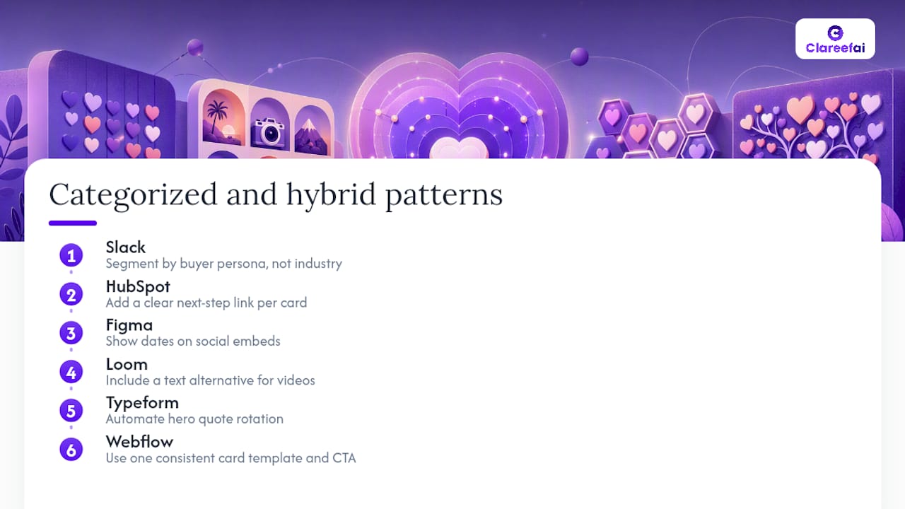
15. Slack Slack’s customer wall organizes proof by company size and industry, letting enterprise buyers filter to Fortune 500 logos and letting SMB buyers filter to companies their own size. Copy this: Segment by buyer persona, not just by industry. Company size is often more persuasive than sector.
16. HubSpot HubSpot’s customer stories page pairs a short quote with a headline metric and a link to the full case study. The wall functions as both a proof gallery and a case-study index. Copy this: Every testimonial card should have a clear next step: read the full story, watch the video, or request a demo.
17. Figma Figma’s community wall pulls in tweets and LinkedIn posts from designers and product teams, organized chronologically. The recency signal (posts from this week) tells visitors the product is actively loved right now. Copy this: Show the date on social embeds. Recency is a trust signal that static quote pages cannot replicate.
18. Loom Loom’s wall pairs video testimonials with written summaries so visitors who cannot watch video still get the key point. The dual-format approach removes friction for every context. Copy this: Always provide a text alternative for video testimonials. Accessibility and SEO both benefit, and you capture visitors who are in a meeting or on mute.
19. Typeform Typeform’s testimonial section uses a rotating carousel for its hero quote and a static grid below. The carousel keeps the hero fresh without requiring a page rebuild. Copy this: Automate hero rotation so your most recent strong quote always appears at the top without a manual update.
20. Webflow Webflow’s wall of love page uses a masonry grid with consistent card sizing, a shared color palette, and a single CTA button (“Start building”) repeated at the bottom of every card. The visual consistency makes the wall feel designed rather than assembled. Copy this: Apply one consistent card template across all testimonials. Mixed card sizes and colors make a wall look unmanaged, which undermines the trust it is trying to build.
For a full taxonomy of proven testimonial wall designs and layout patterns, including masonry grids, video walls, and stats-first templates, TestiGather’s catalog is a practical reference.
How to build your wall of love: a step-by-step checklist
Follow these steps in order. Skipping the measurement setup (step 7) is the most common mistake teams make, and it is the one that prevents you from proving ROI to leadership.
- Define your goal. Choose one primary conversion action: demo request, pricing-page click, or free trial signup. Your layout, content mix, and CTA all flow from this single goal.
- Choose your layout. Masonry grid for high-volume walls (20+ testimonials), minimalist strip for focused sales pages, video wall for high-consideration products, stats-first for metric-driven buyers.
- Collect content. Use a short email request and an in-app prompt (templates below). Prioritize outcome-led quotes over sentiment quotes.
- Verify and get consent. Confirm the customer’s identity, capture written permission for each channel (web, social, paid ads), and date-stamp every record.
- Design and write microcopy. Apply visual hierarchy rules: hero quote first, supporting quotes second, CTA third. Write short bylines (Name, Title, Company).
- Embed on target pages. Choose your implementation path (widget, hosted page, CMS embed, or custom component) and confirm analytics tracking is live before launch.
- Measure and iterate. Capture baseline metrics before launch, then track your primary KPI weekly for the first four weeks.
Collection email template (copy and adapt):
In-app prompt template:
Outcome quotes move the needle on conversion; sentiment quotes build warmth but rarely tip a decision.*
For a complete testimonial collection checklist, including timing recommendations and channel-specific prompts, Clareefai’s marketing blog covers the full workflow.
Design rules and microcopy that increase credibility
Good design does not mean expensive design. It means consistent, intentional choices that make your wall feel trustworthy at a glance.
Visual hierarchy rules:
- Place your single strongest quote or metric in a hero position at the top, with at least 2x the font size of supporting quotes.
- Group supporting quotes in sets of three. The eye reads groups of three as complete, which creates a sense of abundance without visual chaos.
- Position your CTA within one scroll of the hero quote, not at the bottom of a 40-card wall.
Design dos and don’ts:
Gallery-wall design principles translate directly to web layouts. A hero piece anchored by 2–3 repeating palette accents creates visual cohesion across mixed content types. On a testimonial wall, that means choosing one accent color for quote marks or card borders and applying it consistently across every card. Scale and visual center matter too: your hero quote should occupy roughly the same proportion of the page that a large anchor piece occupies in a physical gallery, with supporting items scaled down proportionally.
- Do use consistent card dimensions and font sizes across all testimonials.
- Do include a real photo, company logo, or social avatar for every quote. Anonymous quotes convert poorly.
- Don’t use stock photos in place of real customer photos. Visitors recognize stock imagery immediately.
- Don’t write promotional language in the byline (“John, happy customer”). Stick to name, title, and company.
Microcopy examples:
For your CTA, avoid generic phrasing like “Learn more.” Use outcome-specific language: “See how [Company] did it,” “Get the same results,” or “Request your demo.” The CTA should feel like a natural continuation of the proof the visitor just read.
Visual storytelling principles also apply here: the sequence of images and quotes on your wall tells a story, so arrange them to move from “problem recognized” to “outcome achieved” rather than displaying them in random order.
Implementation options: widget, landing page, CMS, or custom code
Your technical choice affects performance, maintainability, and how easily you can personalize the wall for different audiences. Here are the four main paths:
- Third-party widget (e.g., an embeddable script from a testimonial platform): Fastest to deploy, minimal engineering lift. The widget handles rendering and updates automatically. The tradeoff is limited design control and a potential page-speed impact from the external script. Best for teams that need to ship quickly.
- Hosted Clareefai-powered page: Clareefai generates a verified, branded testimonial page that you link to from your site or embed via iframe. The platform handles verification, consent records, and analytics. Best for B2B teams that need audit-ready consent documentation and cross-channel publishing.
- CMS page with automated pulls (e.g., Webflow, Contentful, or a Zapier-connected workflow): Your CMS renders the wall from a structured data source that updates automatically when new testimonials are approved. Zapier can connect your testimonial collection form to your CMS database, keeping the wall fresh without manual updates. Best for teams with an existing CMS and a developer who can set up the data pipeline.
- Custom-coded component: Full design control, best performance, and direct integration with your analytics stack (GA4, Segment, conversion pixels). The highest engineering cost and the longest time to ship. Best for mature marketing teams with dedicated front-end resources.
Key considerations across all paths:
- Performance: Lazy-load images and video thumbnails. A wall with 30 unoptimized images will tank your Core Web Vitals score.
- Accessibility: Every image needs alt text describing the customer and context. Video testimonials need captions. Keyboard navigation must work for all interactive elements (carousels, filters, play buttons).
- Analytics integration: Fire a custom event (e.g.,
testimonial_wall_cta_click) to GA4 or your CRM when a visitor clicks your CTA from the wall. Without this event, you cannot attribute conversions to the wall specifically. - Personalization: CMS and custom-coded paths allow you to serve different testimonial subsets based on the visitor’s industry, company size, or referral source. This is the highest-impact optimization available once your wall is live.
For a detailed step-by-step testimonial workflow covering collection, verification, and publishing across channels, Clareefai’s blog walks through the full operational process.
How to collect testimonials, verify authenticity, and document consent
The FTC’s endorsement guidelines require that material connections between a brand and an endorser be disclosed, and that testimonials reflect honest opinions. For most B2B walls of love, the practical compliance steps are straightforward.
Consent checklist:
- Written permission from the customer, specifying which channels (website, social media, paid advertising) the testimonial may appear on.
- Date-stamped record of when consent was given and by whom (name and email).
- Contact information for the customer, stored securely for verification purposes.
- A clear opt-out path: customers should be able to withdraw consent, and you need a process to remove their testimonial promptly if they do.
Verification steps:
- For social embeds: save the original post URL and capture a screenshot with the timestamp visible.
- For email or Slack screenshots: retain the original message metadata (sender address, date, thread ID).
- For high-value testimonials used in paid advertising: conduct an identity check (confirm the customer’s name, title, and company via LinkedIn or your CRM) and document the result.
Pro Tip: Store each testimonial’s consent record as a single file (PDF or structured record in your CRM) linked to the testimonial’s unique ID. When an audit or legal review comes up, you can pull the full consent chain in under a minute rather than searching across email threads.
For a deeper guide on secure testimonial management including GDPR-compliant storage practices, Clareefai’s security guide covers both US and EU requirements.
This section provides general guidance on US endorsement and consent practices. Confirm current FTC rules and applicable state laws with qualified legal counsel before publishing testimonials in paid advertising.
How to measure the wall’s impact and run optimization tests
Measurement starts before you launch. Capture your baseline metrics on the target page for at least two weeks before the wall goes live. Without a baseline, any post-launch change is noise.
Measurement framework:
- Capture baseline: Record current demo request rate, pricing-page click rate, time on page, and bounce rate for each page where the wall will appear.
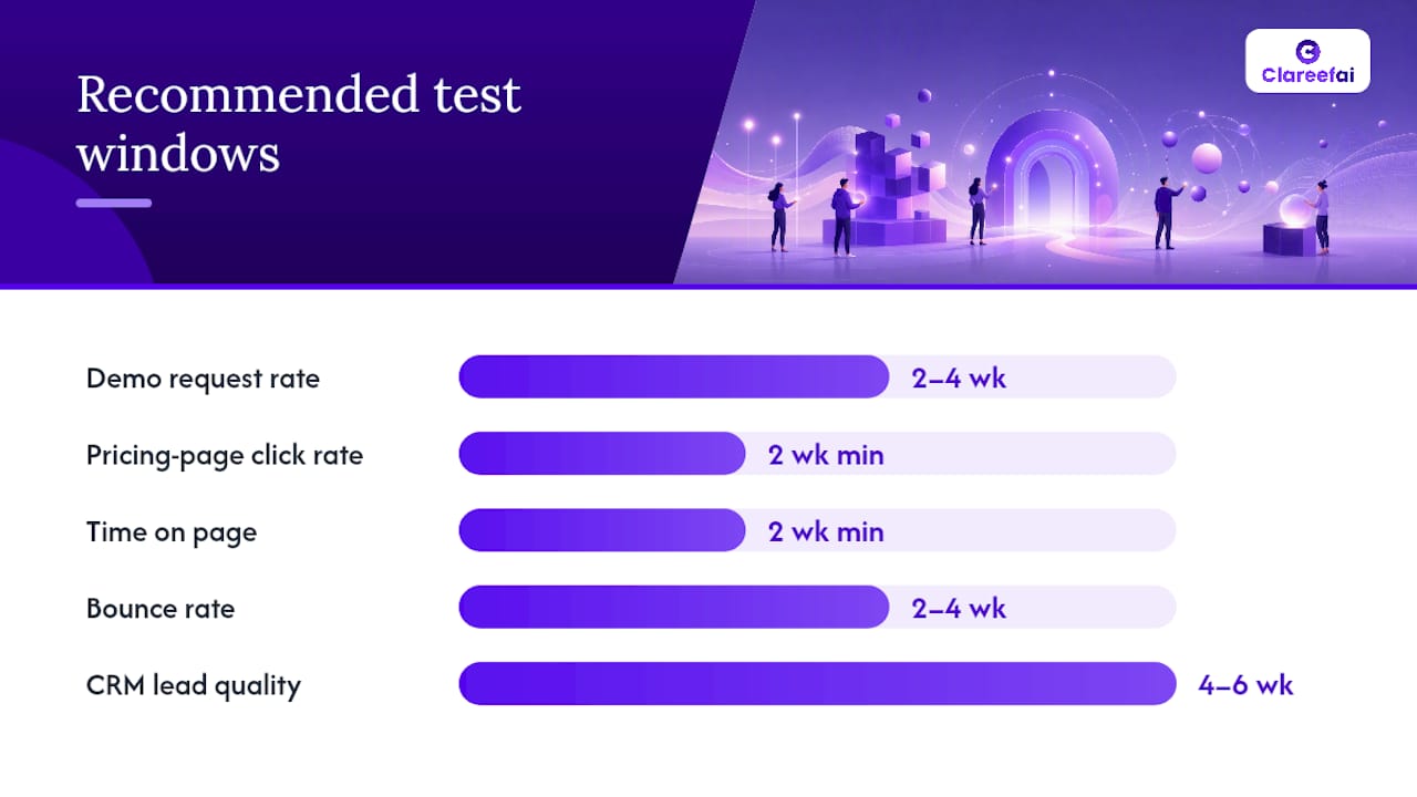
- Set your experiment window: Run A/B tests for a minimum of two weeks, or until you reach statistical significance at 95% confidence. Shorter windows produce unreliable results.
- Attribution approach: Use UTM parameters on your wall’s CTA links and fire a custom GA4 event on CTA clicks. For CRM attribution, tag leads who visited the wall page before converting.
- Iterate: After each test, apply the winning variant and queue the next test. Treat the wall as a living asset, not a one-time build.
A/B test ideas to run in sequence:
- Hero quote vs. stats-first hero: does a metric card or a narrative quote drive more CTA clicks?
- CTA placement: immediately below the hero vs. at the bottom of the wall.
- Social embeds vs. written quotes: which format drives longer time on page for your audience?
- Video thumbnail vs. static quote card: does motion in the hero increase or decrease demo requests?
- Personalized wall (by industry) vs. generic wall: does relevance filtering improve conversion for known visitors?
| KPI | How to measure | Recommended test window |
|---|---|---|
| Demo request rate | Form submissions / unique page visitors | 2–4 weeks |
| Pricing-page click rate | CTA click event / wall page visitors | 2 weeks minimum |
| Time on page | GA4 engagement time | 2 weeks minimum |
| Bounce rate | GA4 bounce rate on decision pages | 2–4 weeks |
| CRM lead quality | Opportunity creation rate from wall visitors | 4–6 weeks |
For testimonial dashboard analytics and how to read conversion attribution data, Clareefai’s analytics guide covers the full reporting setup.
How Clareefai builds and scales walls of love
Clareefai’s workflow maps directly to the build steps above, with the platform handling the parts that most teams find hardest to maintain at scale: verification, consent documentation, and cross-channel publishing.
Here is how the process works in practice:
- Collection: Clareefai automates testimonial requests at key customer touchpoints (post-onboarding, post-renewal, post-support resolution) so your team does not rely on manual outreach.
- Verification: The platform confirms customer identity and contextualizes each testimonial with role, company, and use-case data, replacing anonymous or generic reviews with attributed, specific proof.
- Categorization: AI-driven analysis identifies which testimonials are most impactful for each buyer segment, so your wall surfaces the right proof to the right prospect automatically.
- Publishing: Clareefai syncs verified testimonials to your CRM, your public wall, and your sales team’s outreach materials in real time, so every channel stays current without manual updates.
- Analytics: Role-based dashboards give marketing, sales, and customer success teams the metrics they need: which testimonials drive the most demo requests, which advocates are most active, and where social proof is missing in the funnel.
GDPR-compliant storage and real-time data synchronization mean your consent records and testimonial data stay audit-ready without a separate compliance workflow. For teams managing testimonials across multiple product lines or geographies, the multi-role dashboard structure keeps each team’s view focused on the metrics that matter to them.
See a live example of a Clareefai-hosted customer page to understand how verified attribution and structured testimonial display look in practice.
The case for starting smaller than you think you should
Most marketing teams approach their first wall of love as a large project: design sprint, engineering ticket, content collection campaign, legal review. That sequencing is why most walls never ship.
The smarter approach is a phased rollout. Start with a homepage pilot using your five strongest existing testimonials and a simple card layout. Measure CTA click rate for two weeks. If it moves, take that data to your manager and request the engineering time for a proper embed on your pricing page. Prove lift first, then scale.
Resourcing works the same way. You need three owners: a marketing lead who manages content collection and refresh cadence, a customer success contact who identifies happy customers worth reaching out to, and an analytics owner who tracks the KPIs. You do not need all three from day one. Start with marketing and CS, add analytics once you have data worth analyzing.
One thing to watch as you scale: over-curation kills credibility. A wall with 40 perfectly polished, five-star quotes from Fortune 500 logos reads as curated to the point of suspicion. Leave in the occasional “it took us a few weeks to get the hang of it, but now we can’t imagine working without it” quote. Authenticity in branding builds the kind of trust that polished copy cannot manufacture, and that authenticity is what separates walls that convert from walls that merely look good.
Clareefai powers your wall from collection to conversion
Your wall of love is only as strong as the testimonials behind it, and collecting, verifying, and publishing them at scale is where most teams stall. Clareefai is built specifically for B2B marketers who need to turn customer advocacy into conversion: automated collection at key touchpoints, AI-powered identification of your most impactful advocates, verified attribution for every testimonial, and real-time publishing to your wall, CRM, and sales materials simultaneously.
The result is a wall that stays current, stays compliant, and stays credible without a manual update cycle. If you want to see how unified testimonial management translates into measurable win-rate improvements, the use-case page walks through the outcomes in detail. Clareefai is the publisher of this article. A free trial and demo are available at Clareefai.
Sources
- Testimonial Wall Examples & Templates (2026) — TestiGather | TestiGather
- 19 Inspiring Wall of Love Examples + How to Make Your Own
- Wall of Love
Recommended
Share Article
Stay Updated
Get the latest insights on customer advocacy and SaaS growth delivered to your inbox.