60% Lift From One Move: Website Testimonial Placement for Marketers

Put your strongest, most specific testimonial within reach of every primary call-to-action, especially near your hero, pricing block, and pre-checkout screen. Proximity to the decision point is what drives conversion, not testimonial volume, and moving proof adjacent to a CTA has produced significant lifts in documented tests. Website testimonial placement matters more than how many reviews you collect. Pick one high-traffic page, run a two-week test, and let the data settle the argument.
TL;DR:
- Testimonial placement near the primary call-to-action, especially on high-traffic pages like pricing or landing pages, can increase conversions by over 60%.
- Using a single strong testimonial with verified identity signals next to key CTA zones is more effective than multiple reviews or carousels that most visitors do not see.
- Testimonials should contain specific results, a real identity, and relevant details; a credible rating close to 4.7–4.9 out of 5 appears more authentic.
- A/B testing testimonial placement, especially moving existing proof above the fold, is crucial as it often produces significant conversion lifts.
- Avoid common mistakes like hiding testimonials below the fold, using mismatched quotes, or relying only on carousels without static, verified proof.
Table of Contents
- Website Testimonial Placement: The Highest-Impact Zones
- How to Place Testimonials on Every Page Type
- Which Testimonial Format Fits Which Placement?
- What Makes a Testimonial Actually Convert?
- How Do You Test Testimonial Placement?
- Testimonial Placement Mistakes That Quietly Kill Conversions
- How Clareefai Supports Better Testimonial Placement
- My Quick-Start Checklist for This Week
- Turn Verified Testimonials Into Conversion Assets
- Sources
Website Testimonial Placement: The Highest-Impact Zones
You don’t need to redesign your whole site to see a lift. You need to know which few square inches of a page actually carry weight, and put proof there first.
These are the zones worth testing before anything else:
- Hero section: a one-line micro-testimonial with a photo, sitting beside or just below your headline, works because it’s the first thing a skeptical visitor sees.
- Near the primary CTA: whether that’s “Start Free Trial” or “Get a Quote,” a short quote within 150 to 200 pixels answers the unspoken “should I trust this?” right when someone is about to click.
- Pricing and checkout: a micro-testimonial or trust badge beside the price field reduces last-second hesitation without slowing the flow.
- Before the final CTA on landing pages: a slightly longer, offer-matched testimonial closes the case right before the ask.
If you’re deciding where to start, prioritize the page with the most traffic and the tightest link to revenue, usually your pricing page or your main landing page for paid campaigns. On mobile, assume your visitor sees roughly one screen’s worth of content before deciding to bounce, so the hero and CTA-adjacent zones matter even more than on desktop. Behavioral analytics tools like heatmaps and scroll maps will tell you exactly where visitors actually look, which matters, because a testimonial placed where nobody scrolls does nothing for you.
How to Place Testimonials on Every Page Type
Different pages sell different things, so your testimonial content and its exact position should shift with the page’s job. Here’s how to handle the five page types that matter most.
- Homepage. Put a short, punchy quote near the hero, close enough to your above-the-fold main CTA that a visitor reads both in the same glance. Keep it under 20 words. This isn’t the place for a long case study; it’s the place for a fast trust signal that says “other people like you already made this decision.”
- Product or service pages. Place a result-oriented quote directly next to the product title or the specific feature claim it supports. If a customer photo, video thumbnail, or a “verified buyer” tag is available, use it here; specificity next to a specific claim is what makes the pairing believable.
- Landing pages. Run a one-line testimonial directly under your main CTA, then reserve fuller, more detailed testimonials for right before the final CTA at the bottom of the page. Match the testimonial’s content to the offer on that exact landing page. A generic quote about “great customer service” undermines a page built around a specific discount or feature.
- Pricing and checkout pages. A micro-testimonial or a small cluster of trust badges beside the price field can ease hesitation, but keep it lightweight. Anything that adds friction, a modal, an auto-playing video, a slow-loading carousel, works against you here.
- About and contact pages. Use a relationship-oriented testimonial that names a role and company, supporting your brand story rather than a specific product claim. This is where a longer, more personal quote earns its space.
Pro Tip: Sketch a rough wireframe before you build anything. A hero micro-quote with a photo, a two-column product layout with the quote next to the price, and a full-width testimonial strip before your final CTA cover most use cases without reinventing the layout each time.
Which Testimonial Format Fits Which Placement?
Text, photo, video, and star ratings each do a different job, and picking the wrong one for a given spot wastes the placement. Different formats suit different zones: compact text works best near CTAs where attention is scarce, video performs better mid-page after you’ve already made your value proposition, and photo or user-generated content adds authenticity to product pages where buyers are comparing features.
Some practical tradeoffs worth knowing:
- Micro-text testimonials load instantly and fit tight spaces, but they carry less emotional weight than video.
- Short video testimonials (30 to 60 seconds) build trust fast, but only after a visitor already understands what you’re selling. Don’t lead with video.
- Star aggregates work only when the underlying rating count and spread look credible; a thin sample size undercuts the signal.
- Real-time purchase notifications (“Sarah just signed up”) can nudge urgency on high-traffic pages but feel gimmicky on lower-traffic ones where the pop-ups repeat too often.
Pro Tip: Never autoplay video testimonials with sound. It slows page load, frustrates mobile visitors, and often gets muted or closed before the message lands.
What Makes a Testimonial Actually Convert?
A testimonial that converts contains a specific result, a timeframe, and a real identity, not vague enthusiasm. Named, result-oriented quotes consistently outperform generic praise, because specificity is what makes a claim checkable, and checkable claims feel true.
Every high-impact testimonial should include:
- A concrete result (“cut onboarding time by half in six weeks,” not “great product”)
- A first name, role, and company
- A photo or company logo
- A “verified buyer” tag where your platform supports it
On quantity: homepages do best with one to three testimonials, product and service pages can carry up to four, and landing pages typically run two to four matched to the specific offer. Anything beyond that belongs on a dedicated testimonial archive page rather than cluttering a conversion page.
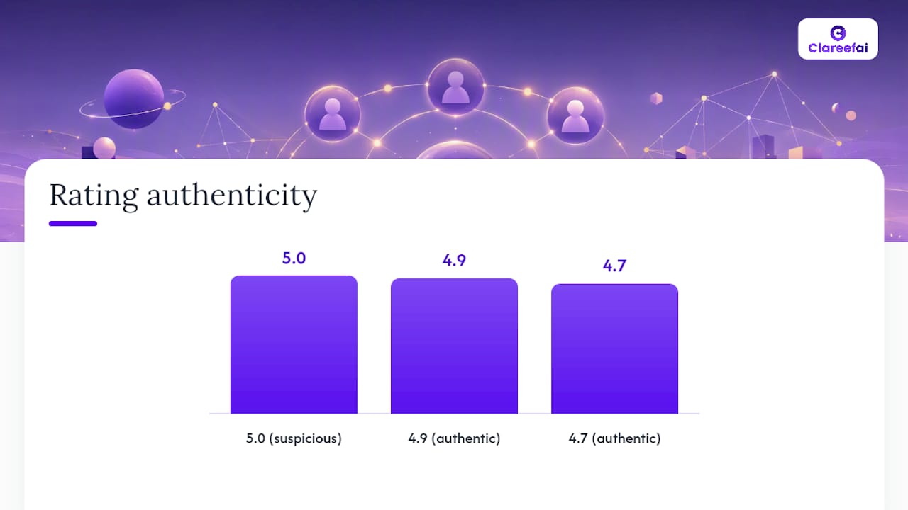
One counterintuitive note on ratings: a flawless 5.0 average across every review can actually read as suspicious. A range closer to 4.7 to 4.9 tends to look more authentic, because real customer bases rarely agree on everything.
How Do You Test Testimonial Placement?
Placement decisions should be tested, not guessed. A/B testing turns a hunch into a measured fact, and the fastest wins usually come from moving an existing testimonial rather than producing new content.
- Pick one variable. Move your strongest testimonial from below the fold to directly beside your primary CTA, and keep everything else on the page identical.
- Set your success metric before you launch. CTA click-through rate and overall conversion rate are the two that matter most; treat bounce rate and session duration as secondary signals.
- Run it long enough to trust the result. Two to four weeks, or until you hit a sample size that gives you statistical confidence, whichever comes first.
- Confirm with behavioral data. Heatmaps and scroll maps will show you whether visitors actually reached the new placement zone before you draw conclusions from the conversion numbers.
Some controlled tests have shown conversion lifts above 60% simply from moving an existing testimonial above the fold, no new content required. That’s the kind of result that should push placement testing ahead of video production on your priority list. Start with your highest-traffic page and the CTA closest to revenue; that’s where a small lift compounds fastest.
Testimonial Placement Mistakes That Quietly Kill Conversions
A few habits show up again and again, and each one has a fast fix.
- Burying your best quote below the fold. Fix it by moving your single strongest testimonial within visual reach of your main CTA.
- Using a mismatched testimonial. A quote about customer support doesn’t belong on a page selling a specific feature. Swap it for one that matches the offer.
- Leaning entirely on a carousel. Rotating testimonials mean most visitors never see your best one. Keep one strong quote static and let the carousel handle secondary proof.
- Skipping identity signals. A quote with no name, role, or date reads as filler. Add a photo, a verification badge, and real details, or don’t run it at all.
How Clareefai Supports Better Testimonial Placement
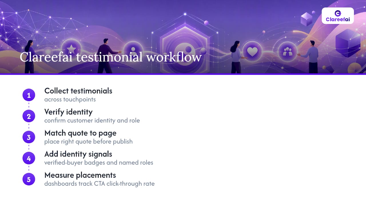
Clareefai’s workflow maps directly onto these placement decisions: it collects testimonials across touchpoints, verifies customer identity and role, and helps you match the right quote to the right page before you publish. Built-in identity signals like verified-buyer badges and named roles increase perceived authenticity right at the moment a visitor is deciding whether to click. Analytics dashboards then let you track which placements actually move CTA click-through rate, so testing stays data-driven instead of guesswork dressed up as strategy.
My Quick-Start Checklist for This Week
Pick one page. Choose one or two testimonials with real identity signals and a specific result. Run an A/B test for two to four weeks and measure CTA lift. If you want help verifying and publishing the right quotes fast, Clareefai’s demo walks through the workflow.
— ClareefAi
Turn Verified Testimonials Into Conversion Assets
Clareefai gives you a faster path to the placement wins covered above: instead of manually chasing customers for quotes and guessing which ones to feature, you get AI-driven identification of your strongest promoters and a verification layer that adds the identity signals proven to build trust at the decision moment.
The platform handles collection, verification, and cross-channel publishing from one dashboard, so a quote your team gathers from a sales call can show up next to your pricing page’s CTA within days, not weeks, and you can measure the lift with the same analytics you’d use for any other conversion test. If your team is managing testimonials across spreadsheets and screenshots right now, that gap is costing you placement opportunities every week you wait. Explore Clareefai’s solutions for sales and marketing teams and start a free trial to see which testimonials your platform would surface first.
Sources
- Where to Place Customer Testimonials On a Website (+Examples) — Crazy Egg
- Social proof placement: 6 fixes that increase conversion — Levri
- Website testimonial examples: Build trust and boost conversions — Webflow
Recommended
Share Article
Stay Updated
Get the latest insights on customer advocacy and SaaS growth delivered to your inbox.