Prove Impact With 3–6 Advocacy Metrics That Link Outputs to Outcomes
Advocacy metrics are the measurable signals you collect to prove that outreach, employee amplification, or customer advocacy actually changed awareness, behavior, or revenue. The core distinction that separates good measurement from vanity reporting: outputs (what you did) versus outcomes (what changed because of it). Start with a handful of cross-cutting numbers: action rate, engagement rate, NPS or CSAT for customer programs, employee adoption or share rate, and one impact indicator like a policy milestone or a testimonial-assisted conversion. Everything else should map back to your theory of change before you add it to a dashboard.
TL;DR:
- Output metrics like email opens and testimonial counts do not demonstrate actual progress toward outcomes or impact, which are essential for credible advocacy measurement.
- Building a clear logic model that links activities to long-term outcomes and impact helps ensure you focus on meaningful, decision-driven metrics rather than superficial numbers.
- Selecting three to six high-value, strategy-aligned metrics and establishing a strict reporting cadence improves data quality and relevance for advocacy programs.
- Combining quantitative tracking with qualitative evidence such as verified testimonials and stakeholder interviews produces more trustworthy attribution of influence.
- Using testimonial platforms that centralize and verify customer stories strengthens outcome proof and makes advocacy impact visible across teams and reports.
Table of Contents
- What Are Outputs, Outcomes, and Impact in Advocacy?
- Which Metrics Matter for Employee, Customer, and Campaign Advocacy?
- How Do You Choose the Right Metrics for Your Program?
- Where Does Advocacy Data Actually Come From?
- How Do You Prove Advocacy Caused the Outcome?
- How Do Testimonial Platforms Strengthen Advocacy Measurement?
- The Three Mistakes That Wreck Advocacy Measurement
- See Advocacy Impact in One Dashboard
- Sources
- FAQ
What Are Outputs, Outcomes, and Impact in Advocacy?
Outputs are the things you can count the moment you finish doing them. An email sent, a testimonial collected, a petition shared, an employee post published. They tell you volume and effort, nothing more. Outcomes are what shifts because of that effort: a prospect who moves from “considering” to “signed,” a lawmaker’s office that changes its public position, a customer who upgrades after reading a peer story. Impact sits one level higher still. It’s the population-level or organization-level change you can only see after outcomes accumulate. Think adoption of a health policy, a measurable increase in brand consideration, or a jump in net revenue retention tied to advocacy-driven upsells.
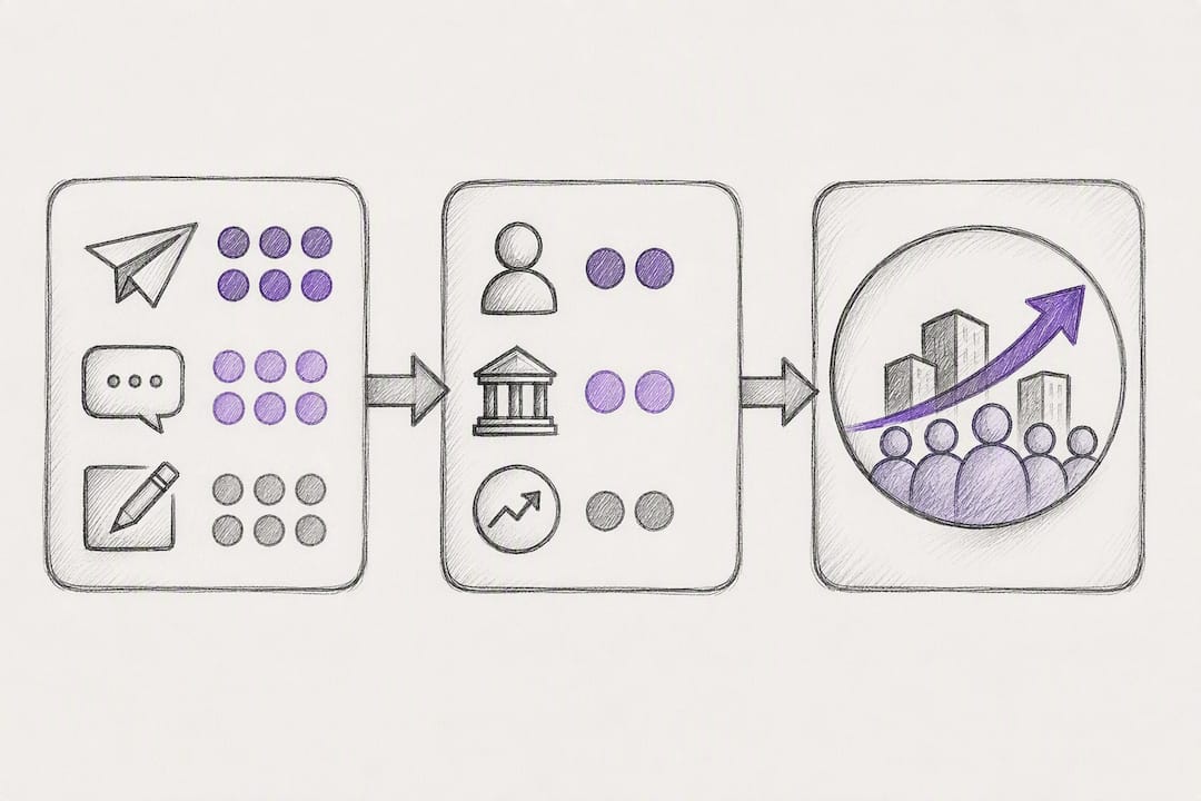
Confusing these three are the single most common measurement mistake in advocacy work. A campaign that reports “12,000 email opens” has reported an output. A campaign that reports “340 constituents contacted their representative, and the bill advanced out of committee” has reported outcomes tied to an actual result. Advocacy indicators are typically classified this way for a reason. Focusing only on outputs routinely fails to demonstrate whether the work actually moved anything, which is exactly why funders and executives grow skeptical of reports full of impression counts and nothing else.
Monitoring and evaluation are not the same discipline, even though most teams use the words interchangeably. Monitoring is the ongoing tracking of what happened and how much. It generates trend lines. Evaluation asks why it happened and whether your program caused it. Monitoring supplies the “what” and “how much,” while evaluation supplies the “why” and the attribution that a monitoring dashboard alone can never provide. You need both. A team that only monitors will have beautiful charts and no way to defend a budget request. A team that only evaluates, periodically, will miss the early warning signs a monitoring cadence would have caught.
A logic model, sometimes called a theory of change, is what connects your day-to-day outputs to the outcomes leadership actually cares about. It maps: activities → outputs → interim outcomes → long-term outcomes → impact. Building one forces a useful conversation before you pick a single metric.
- Activities: what your team does (host webinars, publish case studies, run petition drives)
- Outputs: immediate counts (webinar attendees, testimonials collected, signatures gathered)
- Interim outcomes: early signals of change (increased share of voice, sales cycle shortened, committee hearing scheduled)
- Long-term outcomes: the changes you’re actually trying to cause (policy passed, net revenue retention improved, brand preference shifted)
Timelines matter here more than most teams admit. Output metrics move weekly. Interim outcomes might take a quarter to show a trend. Impact, especially anything tied to legislation or population health, often requires longitudinal tracking against surveillance data systems over a year or more before you can credibly claim anything changed at scale. Set that expectation with stakeholders early, or every quarterly review turns into a defense of why the big number hasn’t moved yet.
Pro Tip: Draft your logic model on a single page before you touch a spreadsheet. If you can’t draw a line from an output to an outcome you actually care about, that metric probably doesn’t belong on your dashboard.
Which Metrics Matter for Employee, Customer, and Campaign Advocacy?
The right metrics differ sharply depending on which kind of advocacy you’re running. Employee advocacy, customer advocacy, and campaign or policy advocacy each have their own vocabulary, their own denominators, and their own version of “success.” Here’s the practical inventory for each.
Employee advocacy metrics
Employee advocacy programs live or die on participation, so the first numbers to track are about who’s actually showing up.
- Adoption rate. The percentage of eligible employees who’ve activated their advocacy account or posted at least once. Calculate it as active participants divided by total invited employees. A program with many invited employees and a significant portion active posters has an adoption rate that tells you immediately whether the rollout worked or whether onboarding needs fixing.
- Share rate. How often active participants actually share content once they’re enrolled, usually tracked as shares per participant per month. This catches the difference between “signed up” and “engaged.”
- Potential reach. The sum of followers across every employee who shared a given piece of content. It’s a ceiling, not a guarantee of views, so treat it as a directional number rather than a hard metric.
- Amplification multiplier. Total reach generated through employee shares divided by the reach your brand channels would have gotten alone. This is the number that best justifies the program’s existence to a skeptical CFO.
- Clicks and click-through rate. Straightforward output metrics, but they matter because they’re the first proof that reach translated into attention.
Customer advocacy metrics
Customer advocacy metrics blend sentiment scores with harder conversion signals.
- Net Promoter Score (NPS). A single-question survey asking how likely a customer is to recommend you, scored from detractors to promoters. It’s a sentiment leading indicator, not a revenue metric.
- Customer Satisfaction Score (CSAT). Typically a post-interaction rating; useful for tracking satisfaction at a specific touchpoint rather than overall loyalty.
- Testimonials and reviews collected. A pure output metric, but a necessary one, since you can’t showcase social proof you never captured.
- Referral rate. Referred customers divided by total customer base over a period. This is one of the clearest outcome metrics customer advocacy programs produce.
- Testimonial-assisted conversion rate. The share of closed deals where a prospect viewed a testimonial, case study, or reference call before signing. This is the metric that finally connects “we collected reviews” to “we closed revenue.”
- Earned media value. An estimate of what equivalent paid coverage would have cost, applied to organic mentions and shared customer stories.
Campaign and policy advocacy metrics
Campaign advocacy runs on a different denominator entirely: constituents, not customers.
- Number of actions taken. Petition signatures, emails sent to legislators, phone calls logged. This is your baseline output count.
- Action rate. Actions completed divided by people who saw the call to action. A campaign that reaches a large number of people and generates a smaller, measurable number of completed contacts has an action rate, a number advocacy platforms increasingly track over time to optimize messaging rather than report once and forget.
- Media mentions. Coverage volume and, more usefully, tone, since ten negative mentions are a very different signal from ten neutral ones.
- Policy milestones. Bill introduced, hearing scheduled, committee vote taken, law passed. These are binary outcome markers that matter far more than any single output count.
- Stakeholder engagement measures. Meetings secured with legislative staff, coalition partners recruited, testimony delivered. These are harder to quantify but often the strongest predictor of eventual policy movement.
How Do You Choose the Right Metrics for Your Program?
Most measurement failures start before anyone opens a spreadsheet. They start with skipping the scoping conversation and jumping straight to “let’s track everything the platform can export.” A four-step process fixes that.
- Clarify who will use the data and what decision it drives. A board deck needs different numbers than a weekly team standup. Defining users, evaluation questions, and intended use before picking indicators is the step almost everyone skips, and it’s the one that determines whether your report gets read or filed.
- Map your strategy to a logic model and generate candidate indicators. For every activity, ask what output it produces and what outcome that output is supposed to cause. You’ll generate more candidate metrics than you need. That’s fine. This step is about breadth, not selection.
- Prioritize three to six measures that balance feasibility and usefulness. This is where discipline pays off. A recommendation worth following closely: prioritize a small set of measures closely tied to strategy rather than attempting to track everything, since too many indicators produce data nobody has time to interpret.
- Set cadence, benchmarks, and a reporting template, then document your data quality checks. Decide upfront whether you’re reporting monthly or quarterly, what “good” looks like for each metric, and who owns pulling the numbers.
Pro Tip: Write your reporting template before your first data pull, not after. If you design the template while staring at real numbers, you’ll unconsciously build it around whatever looks impressive that week instead of what actually answers the question you scoped in step one.
The most common pitfall is treating every available metric as equally important because the platform makes it easy to export. The second most common pitfall is picking metrics that are easy to collect but disconnected from any real decision, like tracking impressions when the actual question leadership wants answered is whether advocacy shortened the sales cycle. Anchor every metric back to a decision someone will actually make with it, or cut it.
Where Does Advocacy Data Actually Come From?
Reliable advocacy measurement depends on wiring together several data sources that rarely live in one system by default.
- Web and engagement analytics track clicks, page visits, and content performance across owned channels.
- CRM systems connect advocacy touchpoints to pipeline stage and closed revenue, which is the only way to calculate testimonial-assisted conversion rates credibly.
- Advocacy and employee amplification platforms track adoption, share rate, and potential reach automatically instead of requiring manual spreadsheet exports.
- Petition and legislative action tools log signatures, contact-your-representative actions, and campaign-level participation trends.
- Media monitoring tools capture mention volume and, with the right service, sentiment and tone.
- Surveys capture NPS, CSAT, and qualitative sentiment that no analytics dashboard can surface on its own. Building a survey that actually produces usable data is its own skill; structured survey design guidance helps avoid the vague, unusable questions that plague most post-campaign surveys.
On the tool side, categorize before you shop. Analytics dashboards handle trend visualization and are usually where your team lives day to day. Social analytics platforms fill the gap for reach and engagement across channels a CRM never touches. Testimonial and advocacy platforms handle collection, verification, and role-based reporting so a sales leader and a marketing analyst aren’t pulling contradictory numbers from the same customer story. Policy trackers exist specifically for legislative status and committee movement.
A few operational habits separate teams with trustworthy data from teams that argue about whose spreadsheet is right. Assign unique IDs to campaigns and content pieces so you can trace a click back to its source months later. Lock your reporting cadence, weekly, monthly, quarterly, and stick to it, since inconsistent pulls make trend lines meaningless. For qualitative measures like testimonial sentiment, sample deliberately rather than reading everything; a consistent sample of 20 stories per quarter beats an inconsistent scan of whatever’s on top. Run a quality check before every report goes out: does this number match last period’s methodology, or did something in the tracking change without anyone noticing?
The strongest evaluation products combine both worlds. Automated trend metrics tell you direction and velocity. Periodic qualitative sampling, a handful of customer interviews, a close read of testimonial language, tells you why the trend is moving. Neither alone tells the full story.
How Do You Prove Advocacy Caused the Outcome?
Attribution is genuinely hard in advocacy work, and pretending otherwise is how teams end up making claims they can’t defend. You rarely get a clean randomized control group when you’re running a policy campaign or a customer advocacy program. What you can build instead is a credible contribution case, which is a different and more honest standard than proof of sole causation.
Several methods exist for building that case, each suited to different questions and resource levels:
- Contribution analysis builds a logical argument for why your program was one of several contributing factors to an observed change, explicitly acknowledging other factors rather than ignoring them.
- Process tracing examines the causal steps between your activity and the outcome in detail, checking whether the evidence at each step is consistent with your theory of change. Advanced evaluators use process tracing and contribution analysis together precisely because a randomized counterfactual isn’t feasible in most advocacy contexts.
- Outcome harvesting works backward from observed changes, asking “what changed, and did we contribute?” rather than starting from predetermined indicators. This method is particularly useful for long, emergent campaigns where outcomes appear in unexpected forms.
- Bellwether interviews ask influential insiders, congressional staffers, journalists, industry analysts, what they noticed and what shaped their view, producing evidence you’d never get from a survey.
- Policymaker ratings directly ask decision-makers to rate the influence of different actors on a given policy shift.
No single one of these methods is sufficient on its own, which is the honest, if unglamorous, conclusion most advocacy evaluators eventually reach. Triangulating two or three of them produces a far more credible report than betting everything on one.
Formative and developmental evaluation designs tend to fit advocacy work better than a rigid summative model, because they produce actionable findings during implementation and allow course corrections rather than waiting until the campaign is over to learn what didn’t work. Whichever methods you choose, report limitations transparently. A funder trusts a report that says “our contribution analysis suggests we were one of three significant factors” far more than one that claims sole credit for a policy win three other organizations also worked toward.
How Do Testimonial Platforms Strengthen Advocacy Measurement?
Platforms built for testimonial and advocate management solve a problem that shows up constantly in the sections above: most of the richest outcome evidence, a customer’s own words, an advocate’s story, lives scattered across inboxes, call recordings, and spreadsheets nobody maintains. Clareefai centralizes that evidence, using AI-driven analysis to identify which verified promoters are worth showcasing and automatically publishing their stories across sales and marketing channels.
Two use cases show why this matters for measurement specifically:
- Testimonial-assisted conversions as outcome evidence. When a CRM shows a deal closed after a prospect viewed a verified customer story, that’s a direct outcome signal, not just an output count of testimonials collected.
- Verified advocate stories as qualitative evaluation evidence. A combination of surveillance-style quantitative tracking with targeted stories of change produces stronger evaluation products for funders and leadership than either alone, and verified testimonials are exactly that kind of qualitative anchor.
Role-based dashboards reduce the data friction that quietly undermines most measurement efforts: sales sees conversion-linked testimonials, management sees ROI-oriented rollups, and marketing sees which stories are earning engagement, all pulling from the same verified source instead of three disconnected exports.
Pro Tip: When a testimonial platform verifies identity and timestamps a customer story, that story becomes usable as evidence in a funder or board report, not just as marketing copy on a landing page.
The Three Mistakes That Wreck Advocacy Measurement
The first mistake is measuring everything the platform lets you export. Teams drown in forty tracked metrics and can’t tell you which three actually matter to a decision. Pick fewer, higher-value measures and defend that choice.
The second is weak data discipline: inconsistent pulls, no validation step, definitions that quietly shift between quarters. Fix it with a locked cadence and a five-minute quality check before every report ships.
The third, and most damaging, is claiming causality you can’t support. “Our campaign caused the policy win” rarely survives scrutiny. A contribution narrative with honest limits earns more trust than a confident overreach ever will.
— ClareefAi
See Advocacy Impact in One Dashboard
Most of the friction in advocacy measurement isn’t the framework, it’s the collection. Testimonials sit in email threads, verified customer stories never make it into the CRM, and by the time someone builds a report, half the evidence has gone stale. Testimonial platforms fix the collection problem directly by identifying strongest verified promoters with AI-driven analysis, automating the request and capture process across touchpoints, and pushing resulting testimonials and video reviews into role-based dashboards that sales, marketing, and leadership teams can use for reporting.
That means your testimonial-assisted conversion numbers stop living in someone’s personal spreadsheet and start showing up automatically next to the rest of your advocacy metrics. If you’re running a customer advocacy program and need cleaner outcome evidence for your next board update, explore the Clareefai platform or see how management teams use Clareefai to measure advocacy ROI and book a walkthrough of your own dashboard.
Sources
A handful of documents anchor most of the practices covered here, and each serves a different purpose.
- Pathfinder: A Practical Guide to Advocacy Evaluation (Funder Edition)
- Policy implementation and outcome evaluation framework — PMC
- Monitoring and evaluation of policy influence and advocacy — ODI
Read the Pathfinder guide first if you’re building a scoping process from scratch; go to ODI when you’re ready to defend a contribution claim.
FAQ
What Are the Four Pillars of Advocacy?
Definitions vary across organizations, but a common framing covers awareness building, coalition and relationship building, direct action or lobbying, and evaluation and learning, each of which needs its own metrics rather than one blended score.
What Are Some Examples of Customer Advocacy Metrics?
Net Promoter Score, CSAT, referral rate, testimonials collected, and testimonial-assisted conversion rate are the core examples, with platforms like Clareefai helping teams track the last one by connecting verified customer stories to closed deals in the CRM.
What Are the Three Main Types of Advocacy?
Employee advocacy, customer advocacy, and campaign or policy advocacy are the three types covered in most measurement frameworks, each with distinct metrics: adoption and share rate for employees, NPS and referral rate for customers, and action rate and policy milestones for campaigns.
How Do I Know if I’m Tracking Too Many Metrics?
If your team can’t recite your top three to six metrics from memory during a status update, you’re tracking too many. Advocacy evaluators recommend a small set of measures closely tied to strategy rather than exhaustive dashboards nobody reads in full.
What’s the Difference Between Monitoring and Evaluation in Advocacy?
Monitoring tracks ongoing trend data (the what and how much), while evaluation investigates causal relationships (the why and the attribution), and effective advocacy measurement requires running both, not choosing one over the other.
Recommended
Share Article
Stay Updated
Get the latest insights on customer advocacy and SaaS growth delivered to your inbox.